Ready to give your landscaping business a visual standout feature? Learn how to create a memorable and effective landscaping logo that resonates with your brand and appeals to your customers.
Key takeaways:
- A well-crafted landscaping logo builds trust and sets the tone.
- Elements of an effective landscaping logo: simple design, natural colors, readable typography, relevant symbols, and adaptability.
- Color choices in landscaping logos convey emotions and attract specific clientele.
- Successful landscaping logos are simple, memorable, and relevant to nature and growth.
- Your logo should reflect your brand’s personality and resonate with your target market.
Significance of a Well-Crafted Landscaping Logo
A landscaping company’s logo is often the first glimpse potential clients have into the merits of your services — think of it as your business’s handshake or first impression. Just like a firm grip can set the tone for a successful meeting, a well-designed logo can convey a sense of trust and expertise before a single word is spoken. It acts as a visual shorthand, symbolizing your company’s commitment to growth and renewal.
This graphical emblem serves several vital purposes. It can set your business apart in a crowded marketplace, where everyone is jostling to have their own green thumb recognized. A thoughtfully constructed logo tells a story about your brand’s philosophy, whether you lean into the traditional, favor the avant-garde, or are dedicated to eco-friendly practices. It’s not simply an aesthetic choice; a logo can communicate a lot about the quality and scope of services offered, from meticulous lawn care to grandiose landscape designs.
Moreover, your logo can travel where you can’t. It’s on your business cards, your equipment, even emblazoned on the sides of your trucks. Everywhere your logo appears, it plants a seed in the mind of potential customers, reinforcing brand recognition and sowing the potential for future business.
Therefore, a logo isn’t just a picture; it’s an investment. An effective logo should amplify your marketing efforts, laying the groundwork for establishing a recognizable and respected presence within the community. As you nurture your clients‘ lawns and gardens, so too should you cultivate your brand identity, starting with a logo that reflects your business’s dedication to beauty, quality, and sustainability.
Elements of an Effective Landscaping Logo
A well-designed landscaping logo doesn’t just sprout out of thin air; it takes thoughtfully chosen elements to truly flourish. Imagine your logo as a seed you’re planting in the minds of your customers. To nurture it into something memorable, start with a simple, clear design. Complexity can muddle your message, so focus on clean lines and a recognizable shape that can scale down to a business card or up to a billboard with ease.
Natural colors work wonders for connecting your brand with the earthy services you provide. Think greens, browns, and floral hues that speak the language of mother nature. But be careful not to overdo it—a jungle of colors can overwhelm the eye.
Typography is like the trellis supporting your landscaping brand—a sturdy, readable font gives structure to your name, while a touch of creativity can reflect your service’s personality, be it elegant, rugged, or whimsical.
Symbols are the blossoming flowers atop your verdant branding. A tree, leaf, or flower symbol can communicate your area of expertise without a single word. But remember, originality counts; avoid the overused clichés that could make your logo blend into the hedge rather than stand out.
Lastly, don’t forget adaptability. A logo that looks just as good on a digital screen as it does on a truck door, uniform, or lawn sign will ensure your brand has the legs to grow across various platforms. Keep it consistent, and your logo will help your landscaping business put down roots in the competitive market.
Color Psychology in Landscaping Logos
When choosing colors for your landscaping logo, think of them as seeds that will eventually blossom into customer’s perceptions of your brand. Each color carries its own emotional weight and can attract specific clientele.
Green is the heavyweight champ in the landscaping palette. It’s the color of growth, renewal, and the natural world – almost a no-brainer for a business that’s all about outdoor transformations. But the shade of green matters; a deep forest hue might suggest established, luxurious services, while a brighter grass green could scream fresh, innovative approaches.
Blue steps in with its calm and trustworthy vibes. It tells customers, “Relax, we’ve got the green thumb you need.” It’s a great support color in your logo, subtly hinting at your reliability and professionalism.
Yellow shines with optimism. A dash here can signal energy and vivacity, like the morning sun promising a new day for a tired garden. But use it like a potent fertilizer – sparingly to avoid overpowering your design.
Brown brings a sense of stability and resilience – qualities prized in a landscape that can stand the test of time and weather. It resonates with organic, natural materials used in many landscaping projects.
And don’t forget about the luxury of black or the cleanliness of white – these can outline and define your logo, giving it a sharp, professional trim, just as a well-manicured lawn edges a property.
Remember, colors are more than aesthetic choices; they’re powerful communicators, softly whispering to potential clients about the life you can breathe into their landscapes. Choose wisely and watch as your brand perception takes root and flourishes.
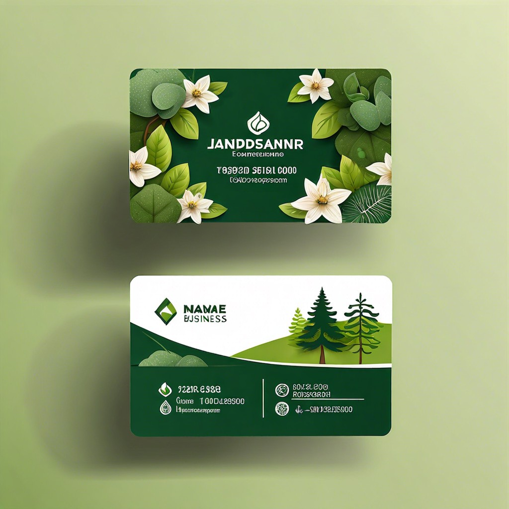
Examples of Successful Landscaping Logos
Picture those captivating logos that stick in your mind, like a blooming flower in a well-manicured garden. These marks of identity often have a few branches in common: simplicity, memorability, and relevance. Looking at the industry leaders, you might notice that successful landscaping logos often reflect growth and nature. They might incorporate green hues to symbolize plant life or use leaf and tree motifs to directly connect with the outdoor element of the service.
Let’s dig a bit deeper—some logos cleverly employ negative space, creating a visual puzzle that, once seen, becomes unforgettable. For instance, imagine a tree where the space between branches outlines a shovel or a pair of hands cradling a sprout. Others take a minimalist approach with a single abstract shape suggesting a landscape, subtly communicating the brand’s focus on design and cleanliness.
But successful logos don’t just paint a pretty picture; they’re also practical. They must be scalable, looking just as good on a business card as they do on the side of a service truck. Acclaimed logos maintain their integrity across various formats, whether embroidered on uniforms or displayed on social media.
Each of these design decisions is deeply rooted in the brand’s story and strategic positioning. A touch of creativity and a well-thought-out concept can grow a standard logo into one that truly embodies the essence of a landscaping business. Remember, in landscaping as in logo design, harmony and attention to the natural flow are key.
Understanding Your Brand Personality
When it comes to your landscaping business, your logo should be the visual whisper of your company’s soul. Imagine your brand as a person. What characteristics would it have? Perhaps it’s the strong, silent type—reliable and steadfast—or maybe it’s the life of the party, bursting with creativity and color.
- Consider these factors:
- If your brand were a friend, how would it engage with clients? With warmth and sincerity, or with polished professionalism?
- What values does your company embody? Sustainability and care for the environment, or premium, luxury services that transform ordinary spaces into outdoor sanctuaries?
- Who is your ideal customer? Is it the family next door looking for a child-friendly garden or upscale clients aiming for award-winning designs?
Your logo should communicate these aspects at a glance. It’s like your brand’s handshake—a first impression that sets the stage for all customer interactions to follow. By aligning your logo with your brand’s personality, you create an identity that resonates with your target market and stands out in the crowded marketplace of garden gurus and yard whisperers.
Related:
Landscape Logo Design: Tips for Crafting Your Outdoor Brand Identity

Landscaping Business Cards: Design Tips and Ideas for Professionals
Landscaping Names: Ideas and Inspiration for Your Garden Business

How to Scale a Landscaping Business

How to Start a Landscaping Business: Step-by-Step Success Plan