In this article, you will learn how to create effective landscaping business cards that capture attention and convey your brand’s professionalism.
Key takeaways:
- Include essential elements for effective landscaping business cards.
- Create visual appeal with color, imagery, and typography.
- Choose durable cardstock suitable for outdoor environments.
- Utilize specialty printing techniques to stand out from competitors.
- Use strategic white space to enhance readability and organization.
Essential Elements for Landscaping Business Cards
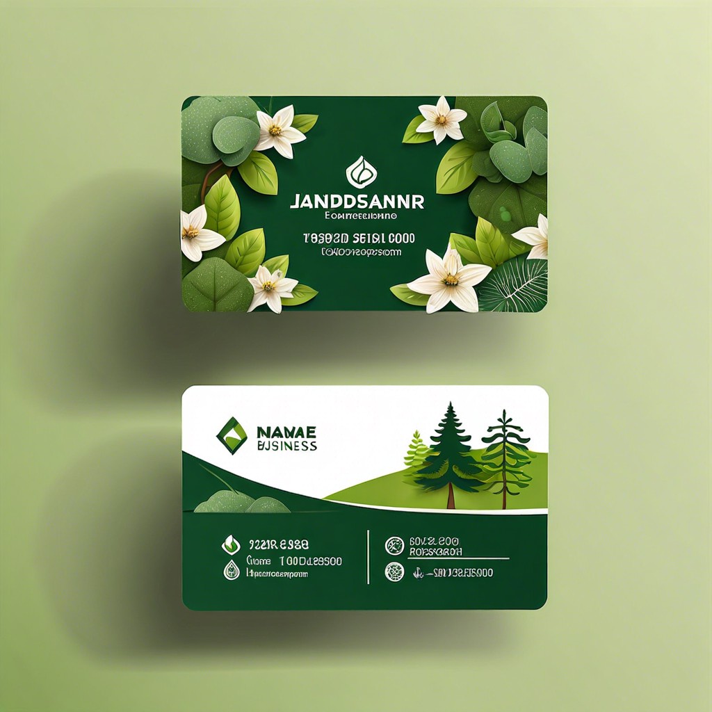
When designing your landscaping business card, it’s crucial to include fundamental elements that communicate your brand and contact information effectively. Your card should feature your company name prominently, ensuring it’s the first thing a potential client sees. Equally important is your name and title, to establish a personal connection.
Contact details cannot be overlooked—include your phone number, email, website, and physical address, if applicable. This makes it easy for clients to reach you through their preferred method of communication.
Your business card also serves as a branding tool, so your company logo should be visible and reflect the nature of your work. Adding a short list of services offered can distinguish you from competitors, informing potential clients about what specific services you provide right off the bat.
Lastly, consider incorporating a tagline or a unique selling proposition that captures the essence of your brand, such as “Creating Green Spaces for Modern Living”. This entices customers by highlighting what makes your service special. Keep each of these elements clearly legible and neatly organized to ensure your business card is as effective as it is informative.
Creating a Visual Appeal With Your Landscaping Business Card
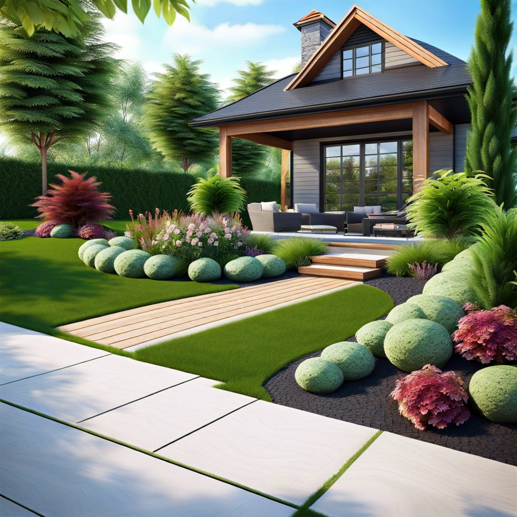
Capturing attention begins with design. A landscaping business card should showcase professionalism while reflecting the beauty and creativity of your services. Start with a color scheme that resonates with nature—think lush greens, earthy browns, or floral hues. This not only reinforces your brand but also creates an immediate association with your industry.
Next, consider imagery. High-quality photos of your work or stylized graphic elements like leaves, trees, or garden tools can speak volumes about your expertise. Balance visuals with the necessary text to ensure your message isn’t lost in a busy design.
Typography also plays a vital role. The font choice should be readable at a glance and complement the overall aesthetic of your card. Whether you opt for a modern sans-serif or a more traditional serif font, ensure it aligns with your brand’s character.
Lastly, logos can’t be overlooked. A well-designed logo acts as a silent ambassador for your business, anchoring your brand identity on the card. If your logo includes symbols inherent to landscaping, it amplifies the thematic cohesion of your business card.
Choosing the Right Cardstock for Durability
Selecting the appropriate cardstock for your landscaping business cards is pivotal, as it reflects the quality and professionalism of your services. A card that feels flimsy or easily damages may not convey the right message to potential clients. Aim for a thicker, premium cardstock, generally measured in points, where higher points indicate thicker, more durable material.
Consider the environment in which the cards will be shared. Landscapers often work outdoors, so a card that holds up against moisture and dirt is beneficial. A matte finish can provide a substantial feel and resist fingerprints, while a gloss finish can help colors pop and add a protective layer.
Weight also matters. Standard cardstock ranges from about 14 to 20 points, with options like 32-point cardstock offering a luxuriously thick and sturdy option, ensuring your card won’t easily bend or tear.
For those wanting to emphasize eco-friendliness, recycled cardstock is available, aligning your branding with your commitment to the environment. It’s a subtle nod to sustainability that can resonate well with clients.
Finally, take into account the finish and texture. Textured cardstock can add a tactile element, inviting people to engage more closely with your card, and by extension, your business. Just ensure the texture doesn’t interfere with the legibility of your contact information or design.
In summary, the cardstock you choose should withstand the test of time and use, just like the landscapes you create. The right selection here reflects the resilience and attention to detail that your business stands for.
Standing Out With Specialty Printing Techniques
In a competitive field like landscaping, capturing potential clients’ attention immediately is essential. Specialty printing techniques can be the differentiator. Let’s explore a few options:
- Embossing: This technique raises portions of your card’s design, adding a tactile dimension that can enhance your logo or business name.
- Foil Stamping: Foiling can infuse a touch of luxury into your branding. Metallic, matte, or even holographic finishes can make key elements pop off the card.
- Spot UV Coating: Apply a glossy layer on specific areas of your card for a striking visual contrast. It’s perfect for highlighting design features or making your contact information stand out.
Remember, the aim is to distinguish your business card from the stack on a client’s desk. By using these specialty printing methods, your card will not only reflect the quality of your landscaping services but also demonstrate a commitment to detail that can win over discerning customers.
Strategic Use of White Space
White space, often referred to as negative space, is the unmarked area of your business card that doesn’t contain text or imagery. Far from being wasted space, it plays a vital role in design by helping to balance elements, making your card look professional and easy on the eye. Here’s why it’s important and how to use it effectively:
- **Enhances Readability: ** Clutter can overwhelm the eye, but white space gives each design element breathing room. This helps potential clients easily find the information they need, like your contact details or services offered.
- **Focuses Attention: ** By isolating key pieces of information, such as your logo or business name, white space helps draw attention directly to them. It enables these elements to stand out and be remembered.
- **Creates a Premium Look: ** More white space often gives the impression of luxury and high quality. For a landscaping business, this can subconsciously align your brand with notions of meticulous care and upscale services.
- **Improves Organization: ** Utilize white space to group related information. For instance, your contact details should be situated together, separate from your services or tagline. This helps in guiding the viewer’s eyes logically through your card’s content.
Remember, white space doesn’t necessarily have to be white; it simply needs to be free of text and images. It could be a color that ties into your branding or even a background texture that resonates with your landscaping theme. Embrace the less-is-more approach to foster an effective visual communication through your business card design.
Related:
Landscaping Logo Design: Step-by-Step Creation Guide
![]()
Landscape Logo Design: Tips for Crafting Your Outdoor Brand Identity

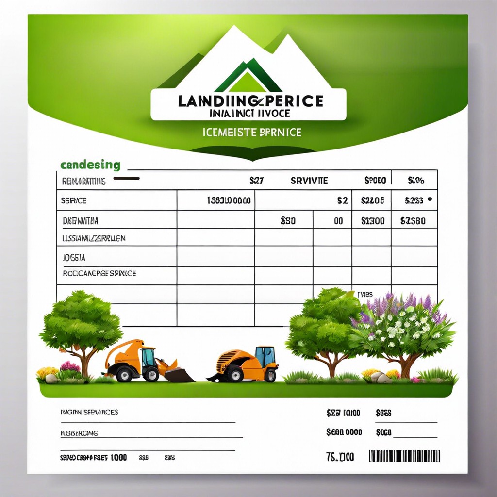
Landscaping Invoice Template: How to Create One That Gets You Paid Faster
Landscaping Names: Ideas and Inspiration for Your Garden Business
How to Value a Landscaping Business [Solved]